
Today I will be working with the following ArtFoamie:
- Prickly Circles designed by Cat Kerr

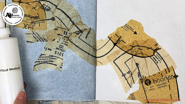
I am working in the Dina Wakley Mixed Media Blue edition art journal. It is quite a challenge to overcome the fabric blue jeans pages. One thing I have learned over the past year of working in this journal is that it’s an easier page to work in if you stiffen it up and neutralize the color. I try to use gesso on it because the fabric soaks up the gesso and stiffens right up. Another method I’ve used is to collage on the page immediately.
First, I apply gesso to both sides of the layout then I add a bit of collage. I have chosen some pattern tissue paper that has bold dark lines on it. I love how bold images peek through soft muted bokeh type layers.

My next step is to add a bit of texture. Today I have chosen some home-made glass bead gel. Once it dries, I will apply some Payne’s Gray Acrylic paint using a brayer and gel plate as my palette to the Prickly Circles ArtFoamie. Then stamp it onto my layout.


Next, I go in with a water-soluble gel crayon in yellow and teal. These two colors mixed, is a new favorite discovery. I concentrated on adding it into the areas where I applied the glass bead gel texture. I have found two methods of working with the water-soluble gel crayons that fix it to the paper. One is to work gesso into it and the other is using gel medium. This time I am working with gesso. When it gets a bit too dry or concentrated in color, I apply a bit of water using a spritz bottle.


At this point in the layout, I realize that I need to draw the eye across the page. In order to accomplish this, I go in with some Cadmium Yellow acrylic paint and concentrate on applying it into the bold circles of the ArtFoamies stamped image. Muting the Cadmium Yellow down with some gesso I then apply some using my fingers to the background. This helps to bring the layout into a cohesive piece.


To accentuate the texture, I will do a bit of finger dry brushing using a contrasting color, Payne’s Gray in an Acrylic Paint, and then a bit using gesso. This pulls the highlighted areas forward to help give it dimension.

Next, I add a Maya Angelo quote, a vintage photo and some orange acrylic paint to bring the quote background color into the layout for a little pop. Lastly, I add a bit of Distress Archival Ink in Peeled Paint around the edges of the layout.


I love the dappled type of light that emanates from the layout. It reminds me of being a child, at the lake we lived near and peering up through the underbrush towards the sky. It felt like the entire world was right in front of me.
Check out THIS VIDEO to see the full creative process!

-Nina
www.ninafickettdesigns.com
What a fun and whimsical page! We love this and thank you so much for sharing your art!
ReplyDeleteThank you for having me, it's been so much fun.
Delete